The challenge.
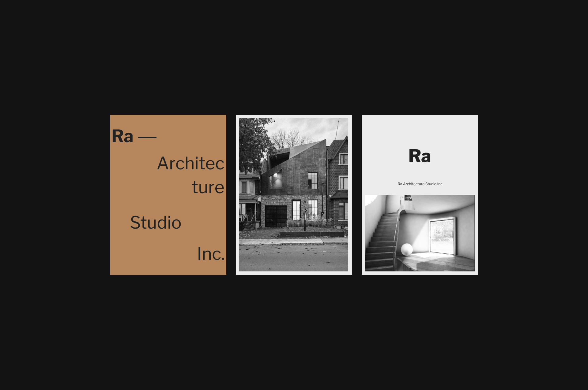
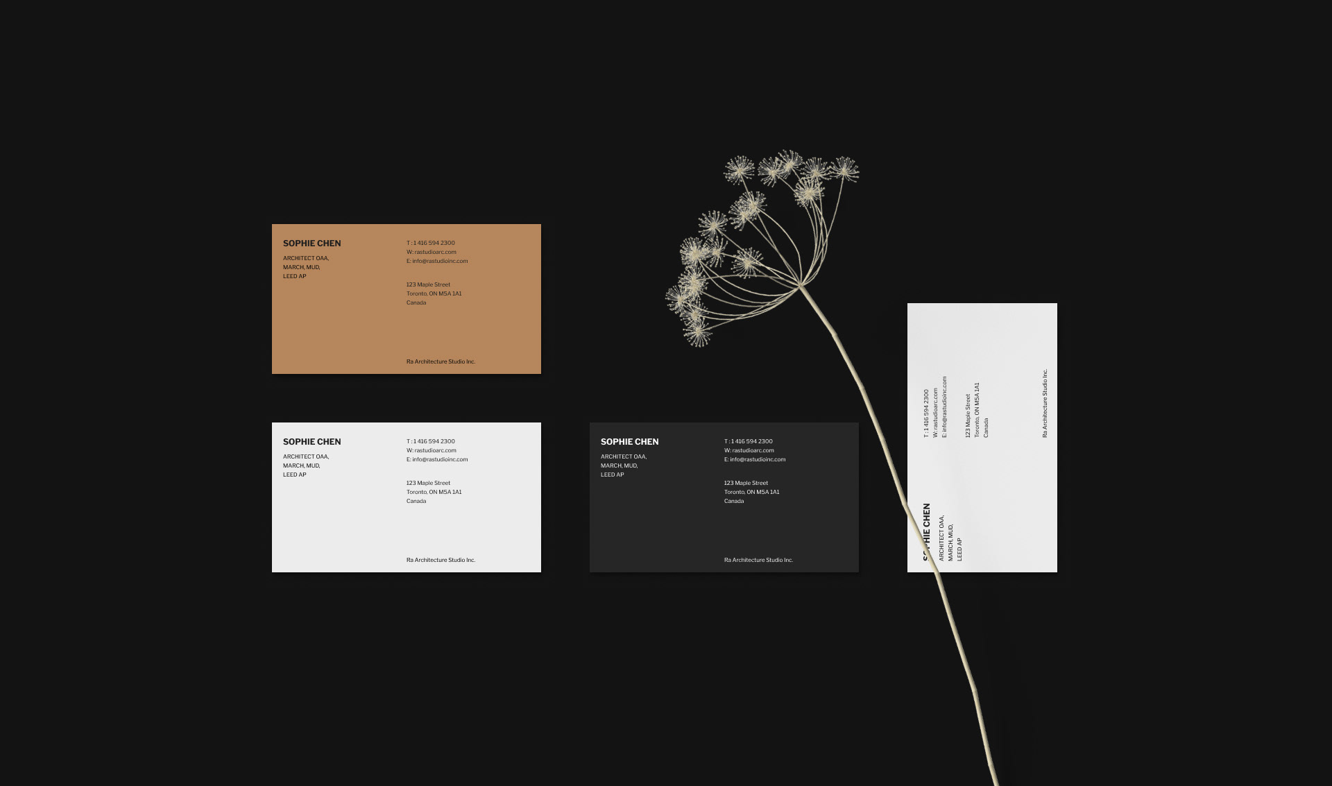
The studio needed an identity that felt like its own architecture: rational, minimal, and system driven. Anything decorative or trend led would have worked against the work itself. The harder part was making that identity hold up consistently across very different formats, from a business card to a full website, without losing its precision.
The approach.
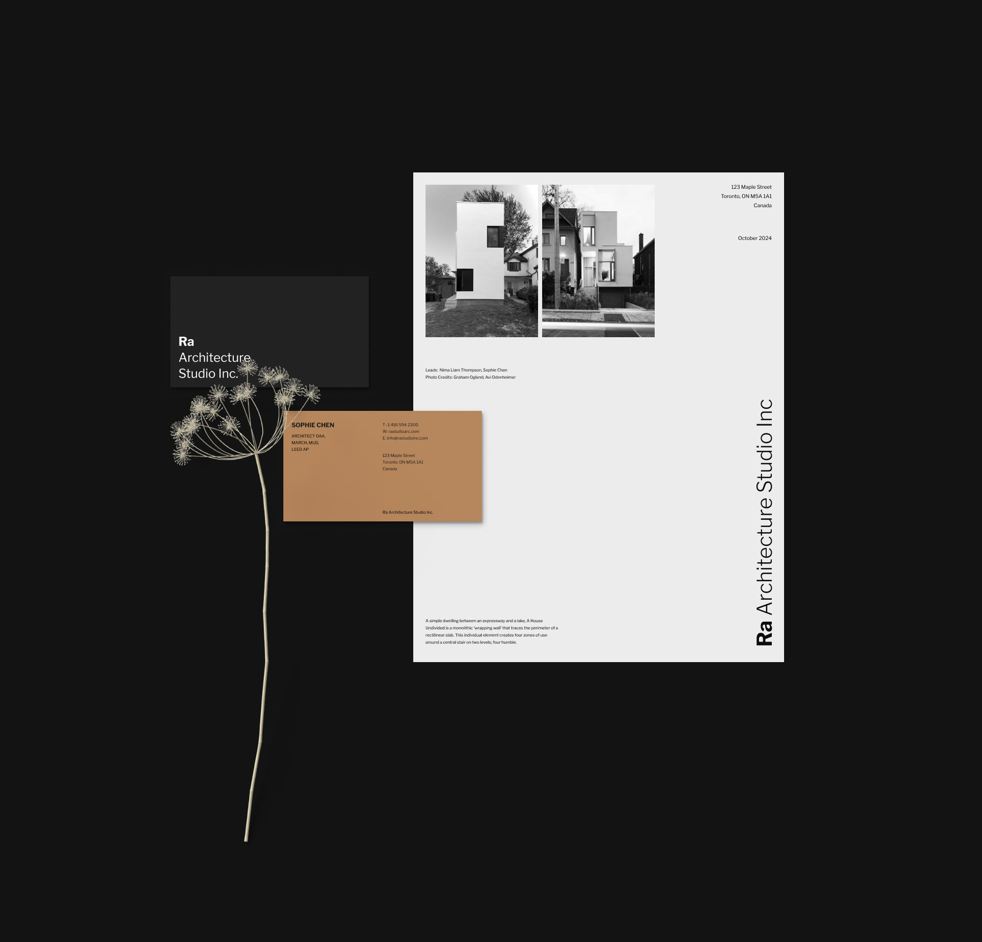
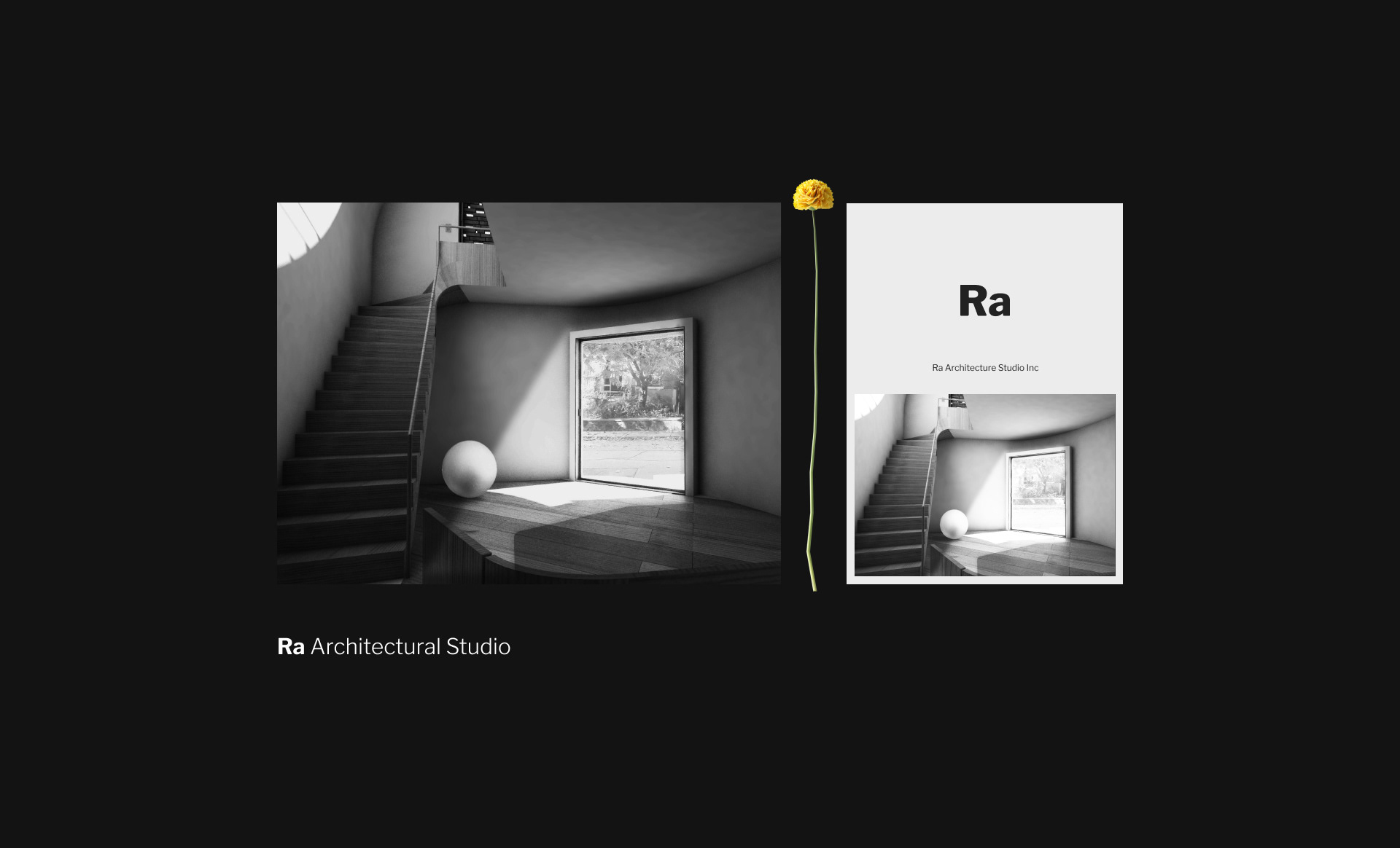
I treated the identity as a modular system rather than a fixed logo. Every element follows a clear logic of structure and composition, so the studio can build new layouts on the same rules instead of redesigning each time. Refined typography, geometric forms, and a controlled use of space give the brand both discipline and quiet visual confidence.
From identity to website.
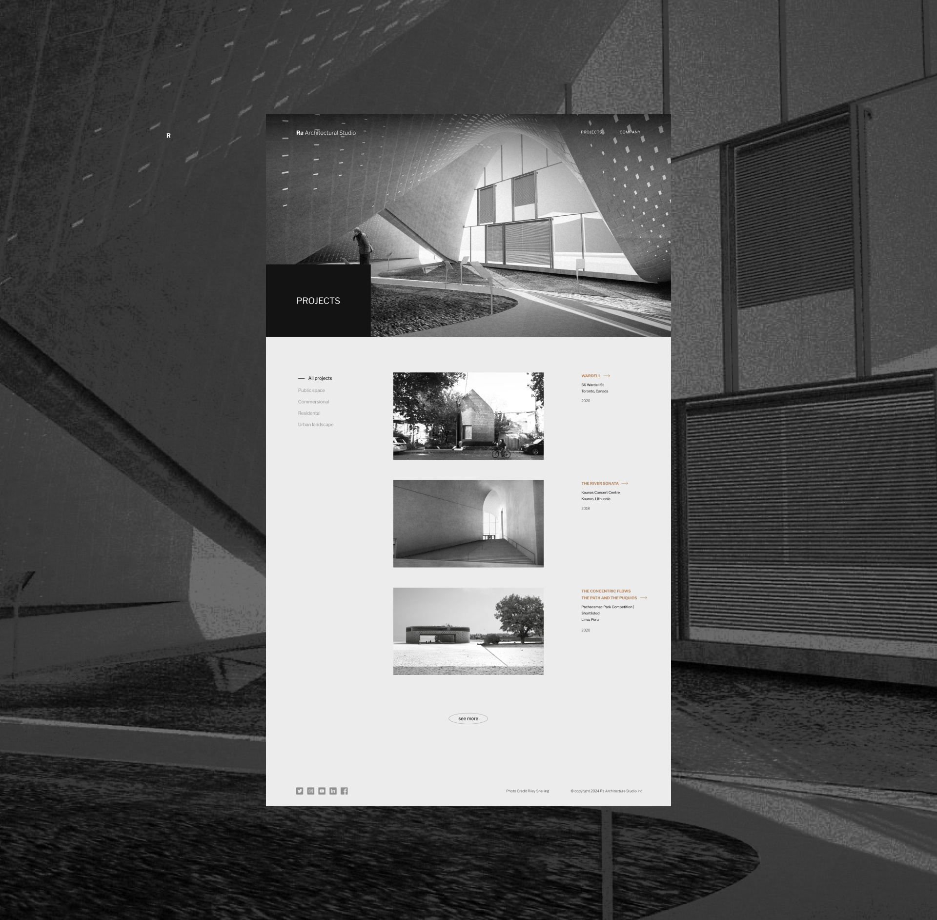
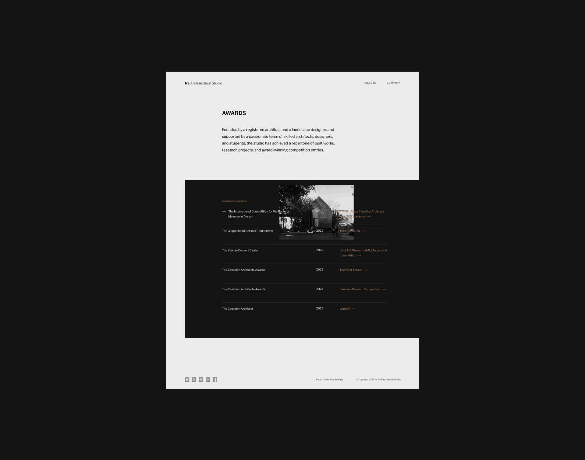
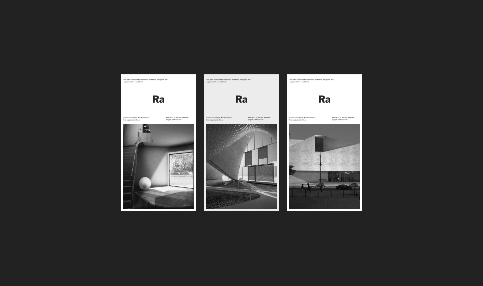
The same grid logic carries directly into the studio's website. Spacing, type, and proportion follow the rules set in the identity, so the brand and the digital experience read as one continuous system rather than a design applied on top. The result is a website that feels structural, calm, and unmistakably the studio's own.
The outcome.
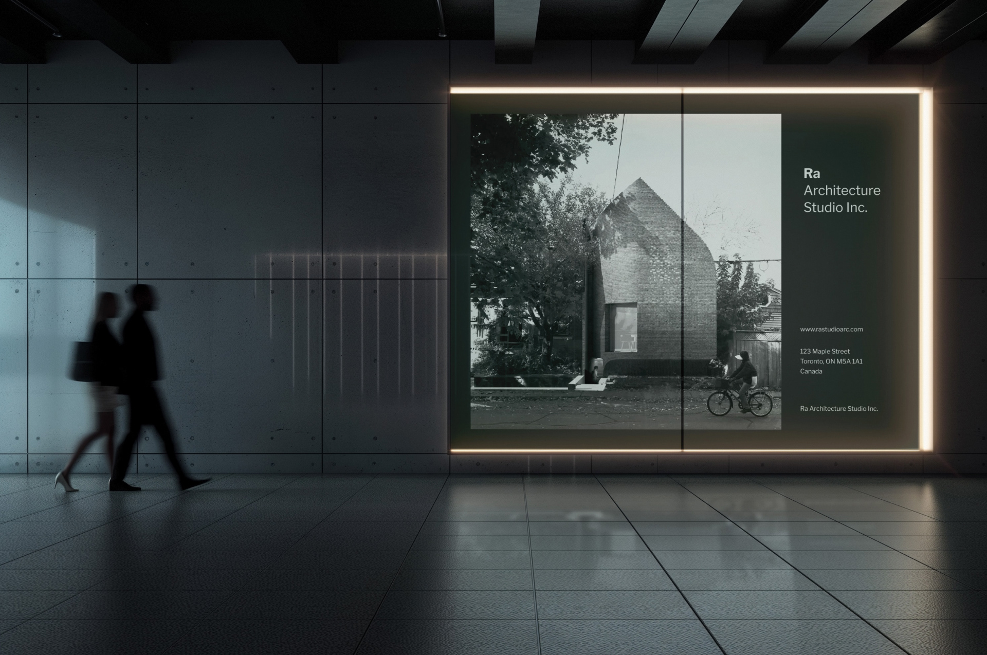
A coherent visual system that scales across print, digital, and the website, and that the studio can keep extending on its own. The identity does not just label the practice, it works the way the practice works.