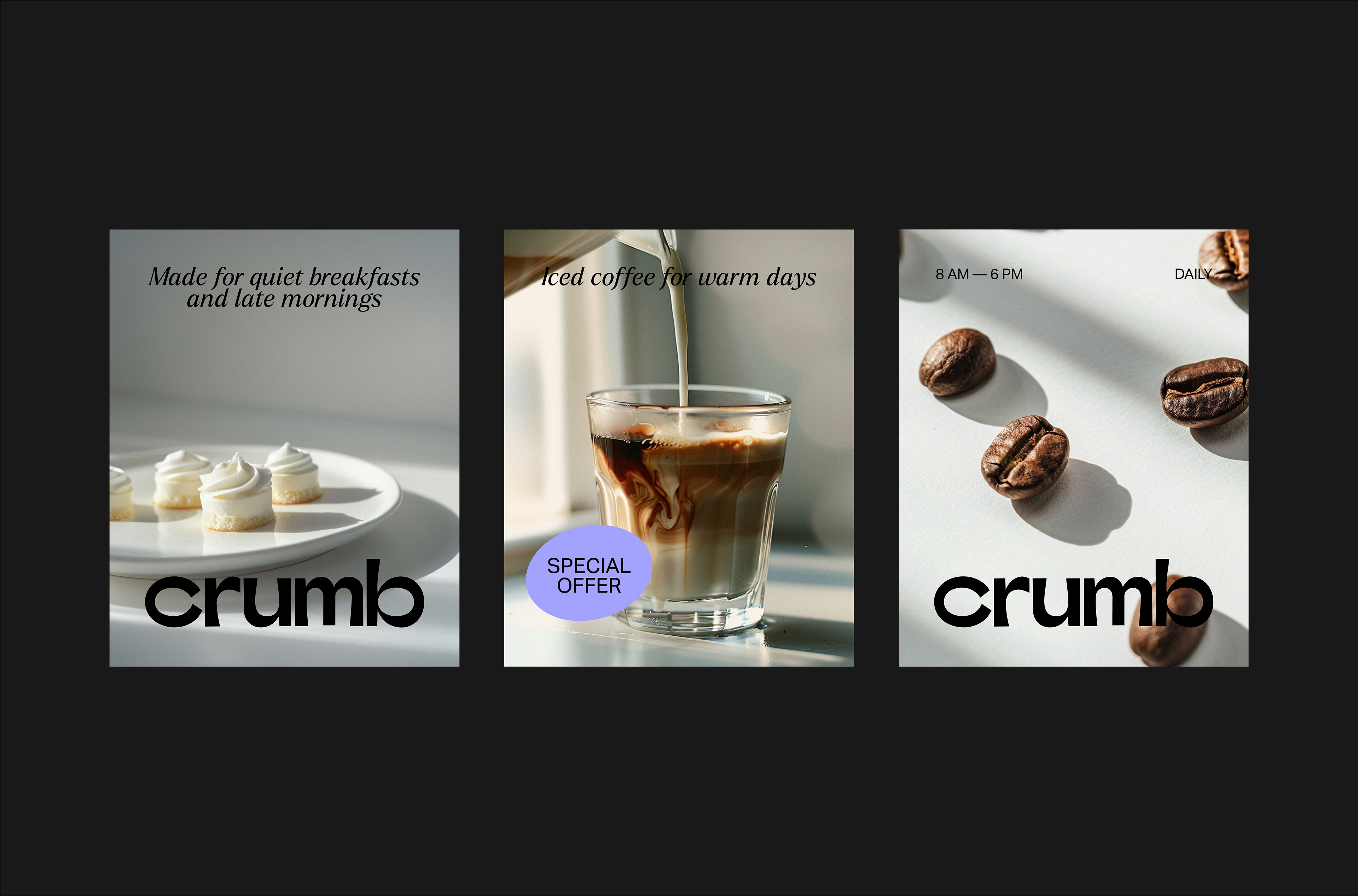

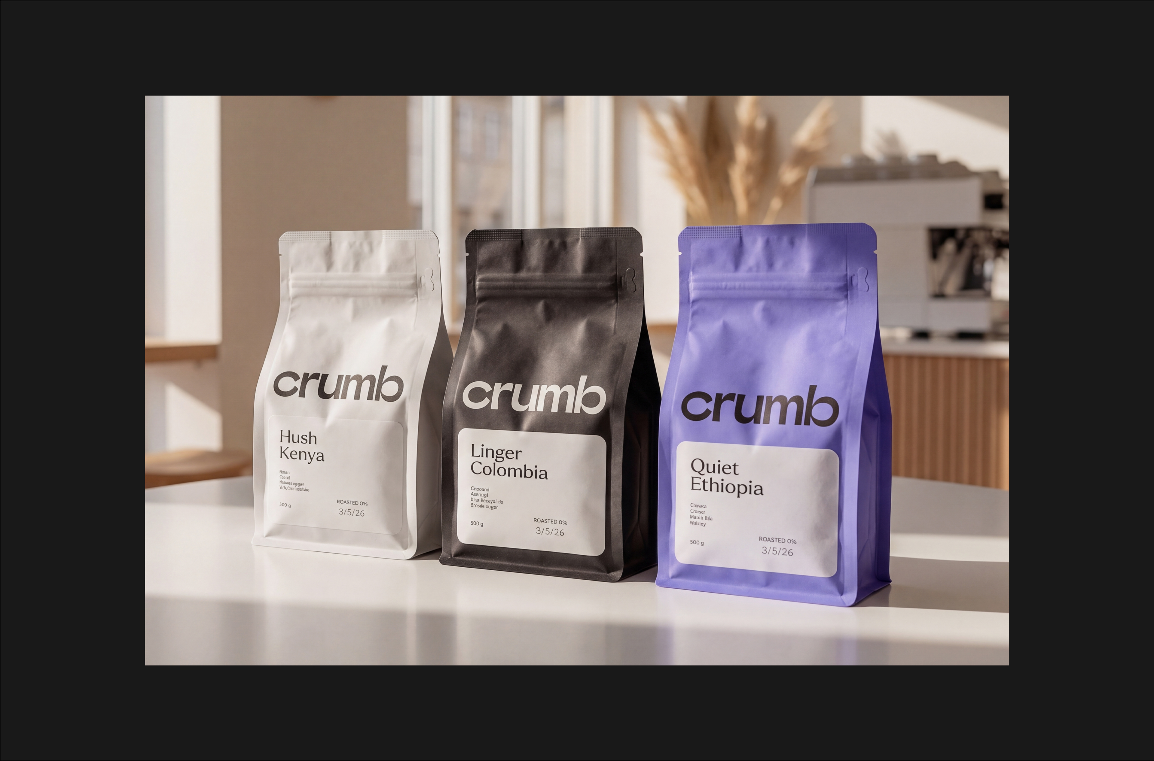
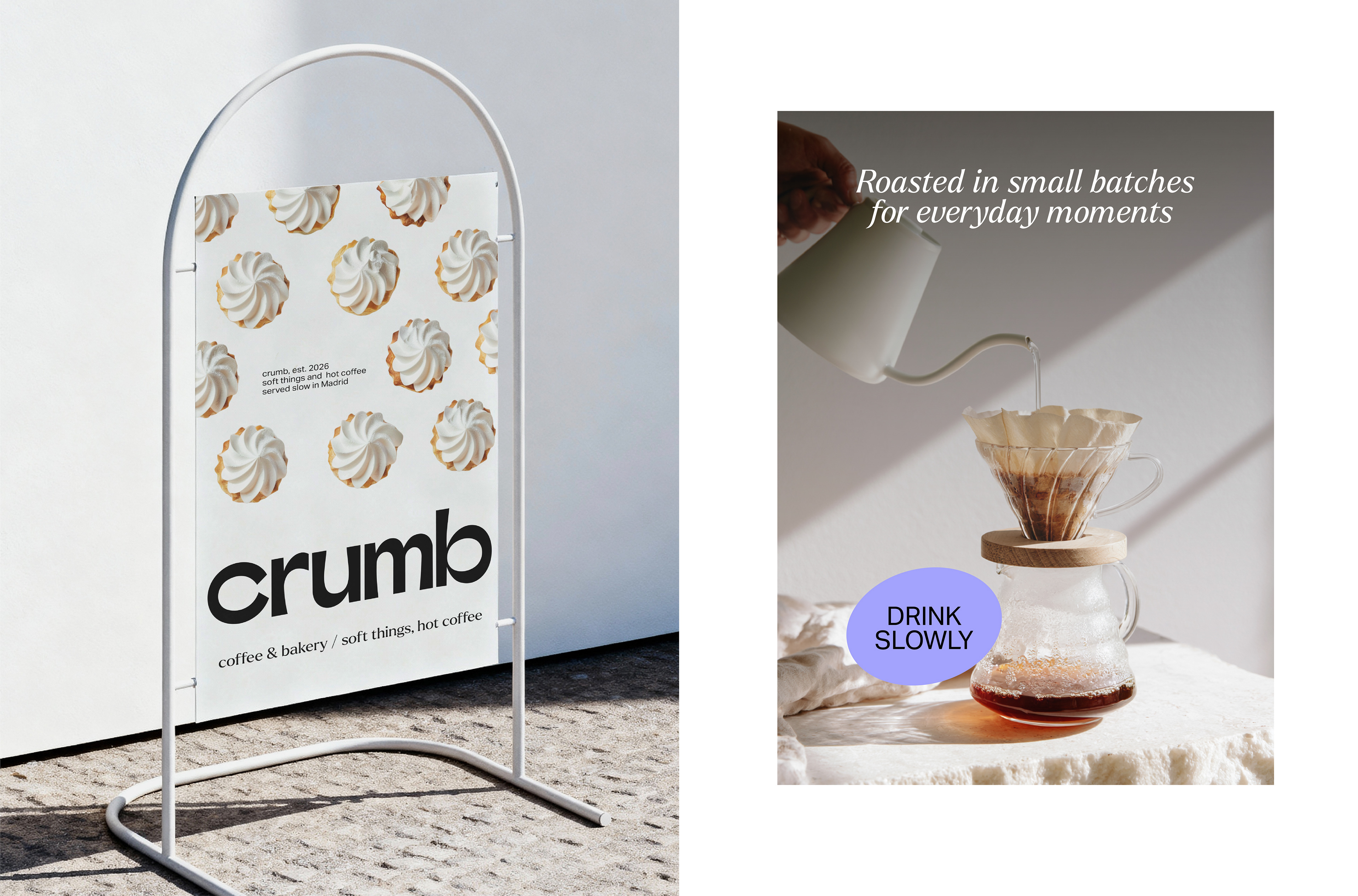

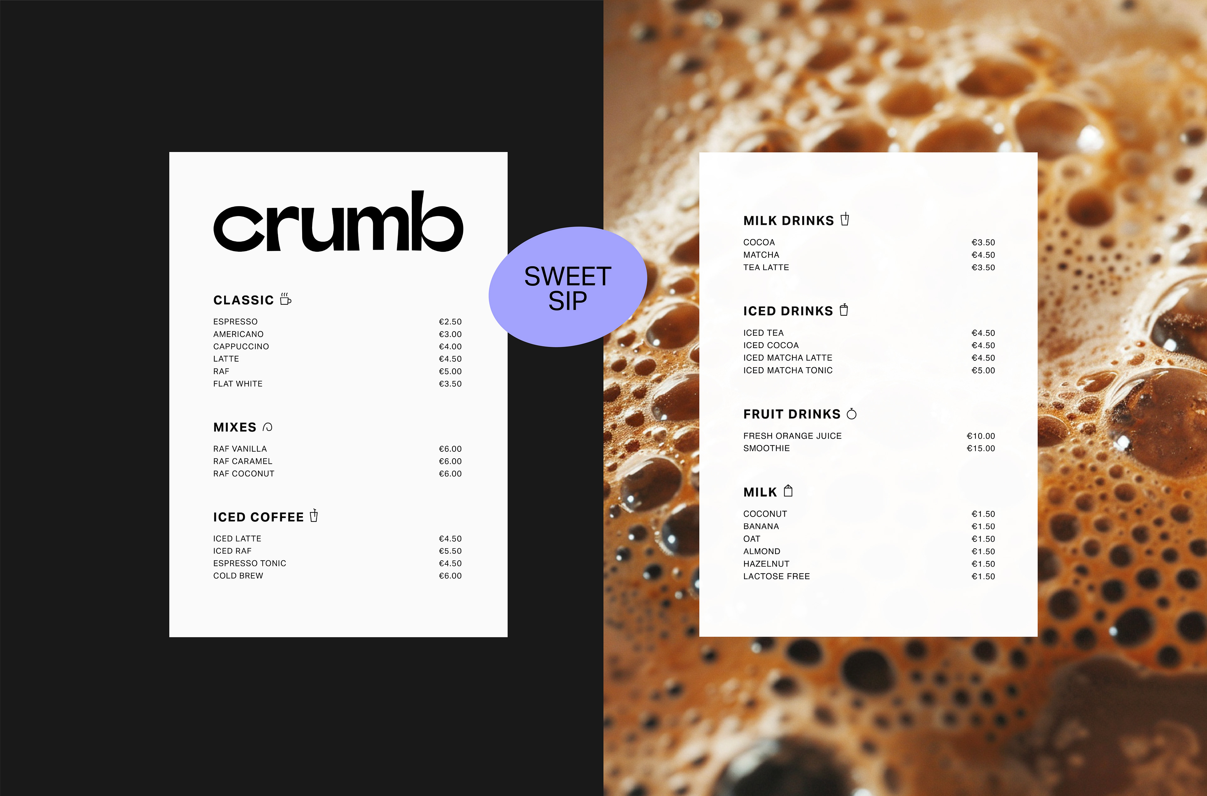
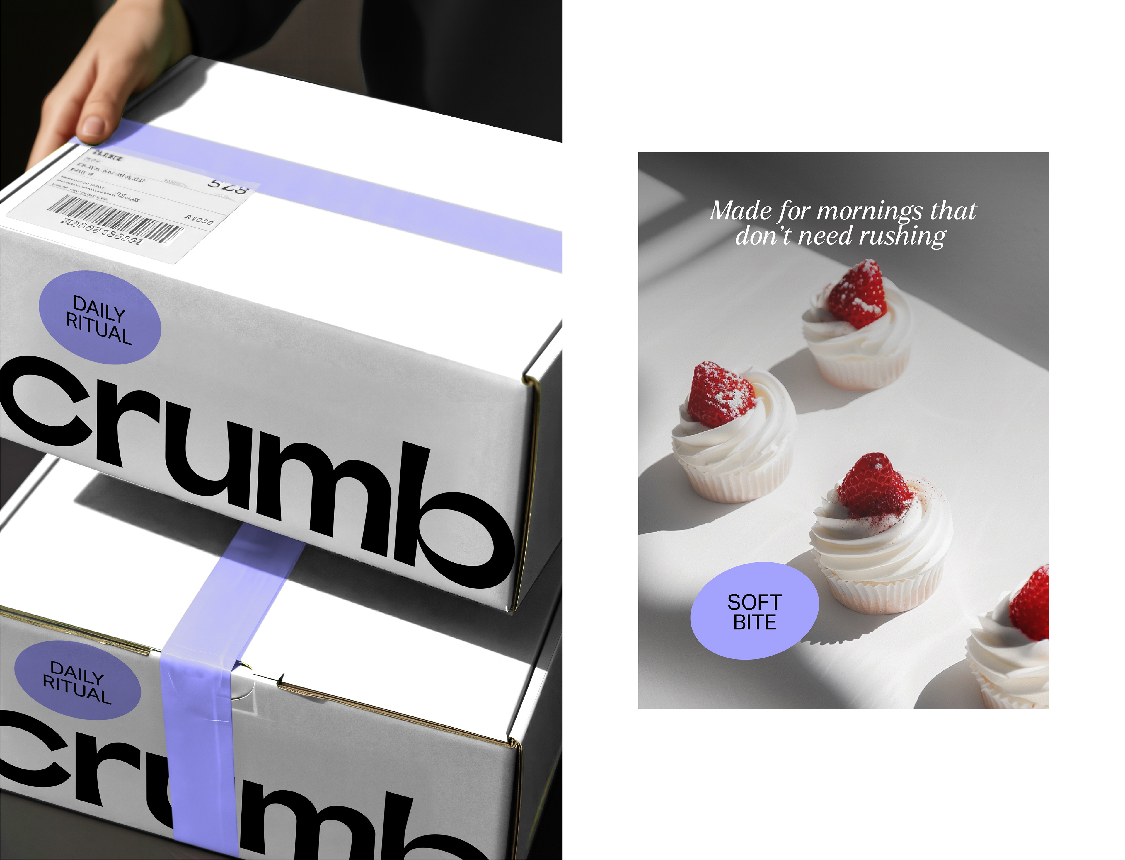

Crumb is a specialty coffee and bakery brand from Madrid, built on a simple idea: that the small things are worth taking seriously. The goal was a visual identity that reflects that mindset — calm, intentional, and quietly confident. The system runs on three colors: white carries the space, black holds the structure, and a soft lavender works as the brand's signal. Lowercase typography, small oval stickers, and a naming system that pairs a quiet verb with an origin, Hush Kenya, Linger Colombia, Quiet Ethiopia, create a brand that asks you to slow down before the first sip.